Emma Woolldridge

Hi, I’m Emma – a research-driven designer and typographer with a keen eye for editorial, UX/UI, and branding disciplines. My studies have taught me the importance of designing with meaningful purpose, rather than for aesthetic pleasure. My work reflects this motto, with each project based upon market, user, or audience research.

 

Encore

Editorial

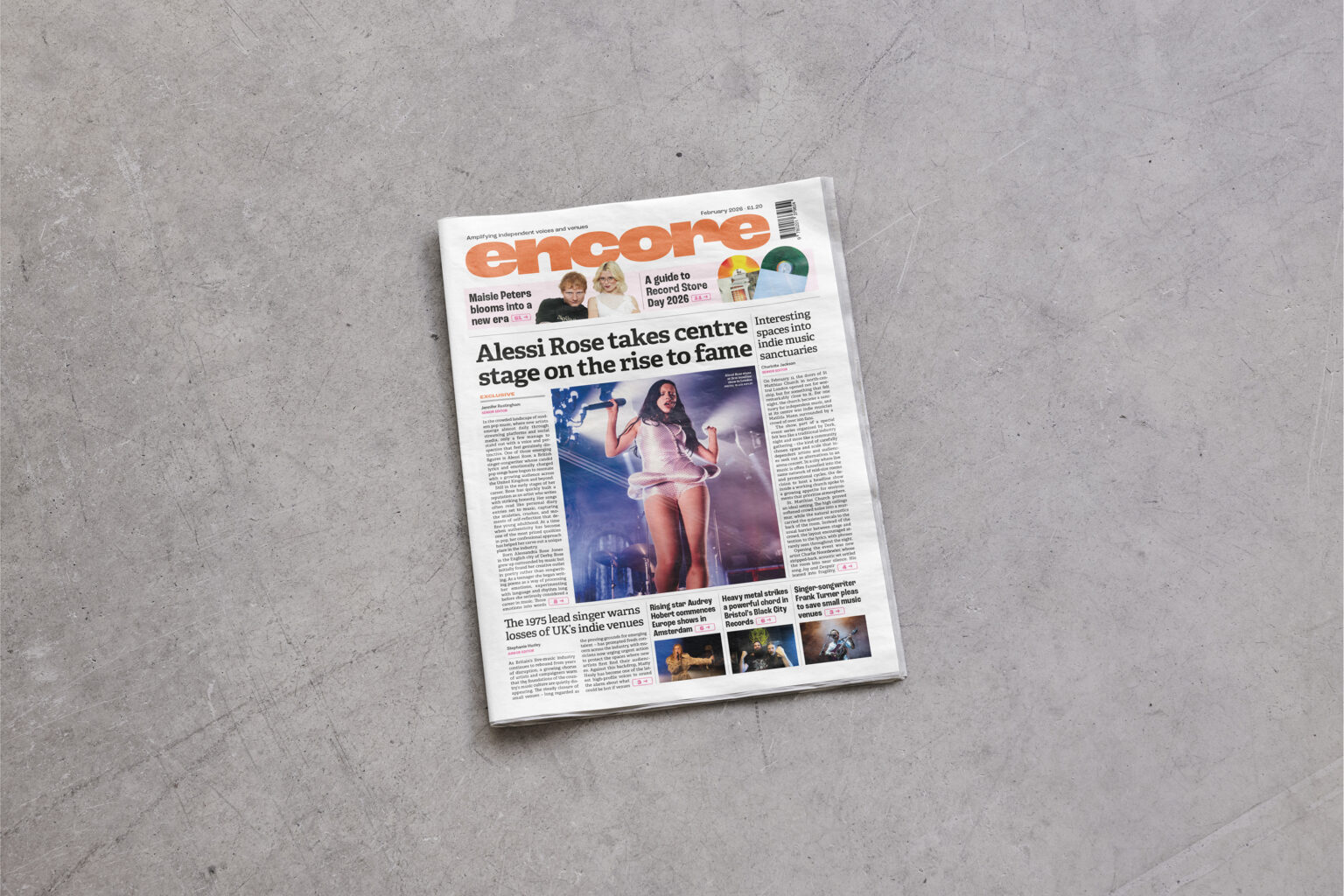
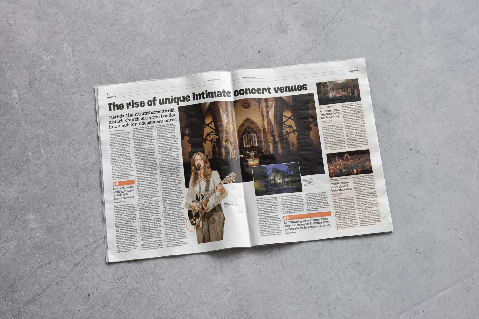
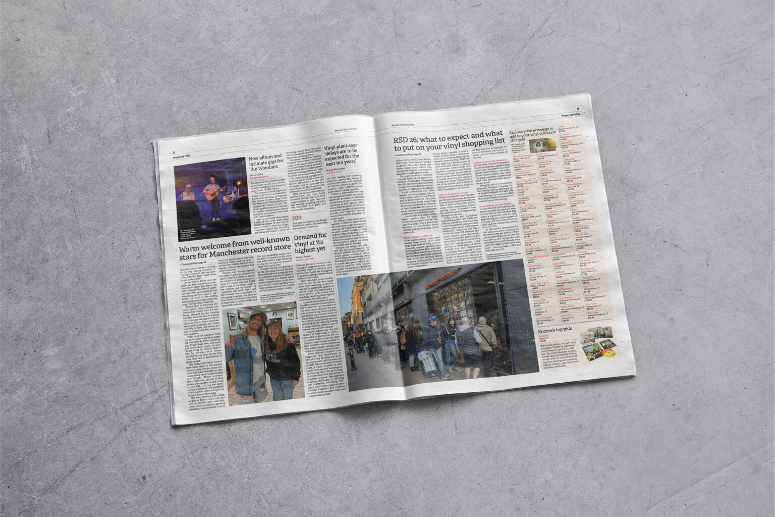
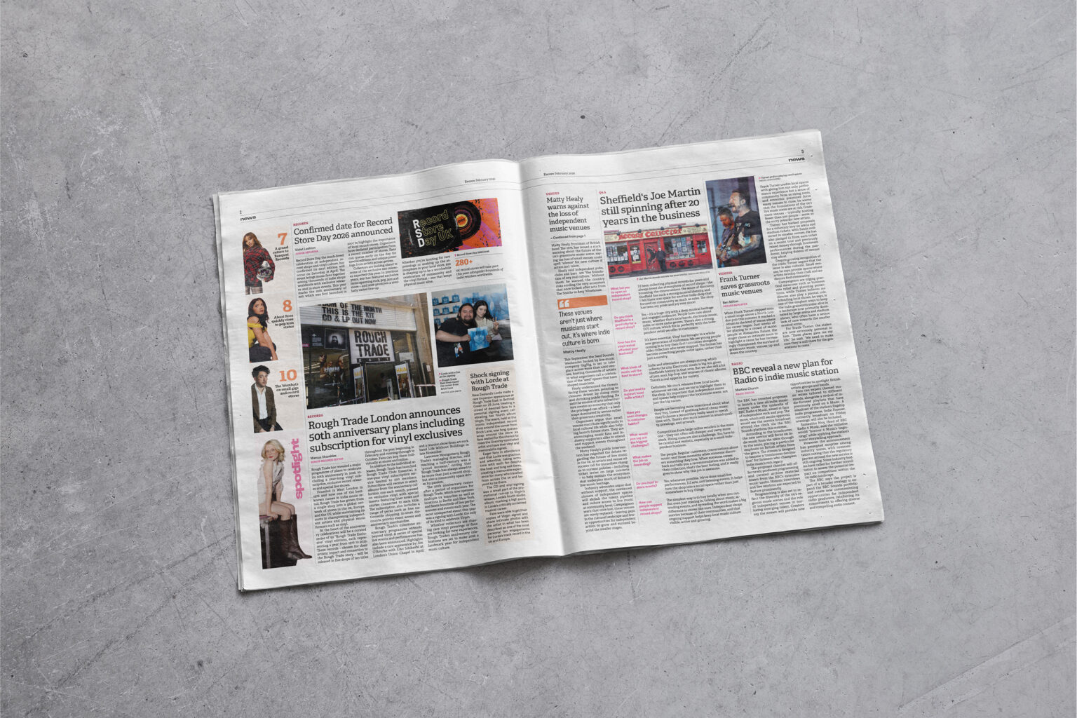
Encore is a newspaper that amplifies independent artists and intimate music venues. With a new issue released monthly, indie fans can keep up to date on record store events, physical music signings and unique gigs. Structured by a five-column grid, Encore takes inspiration from the system used and created by The Guardian in order to communicate news purposefully.

Volvic sparkling water

Packaging

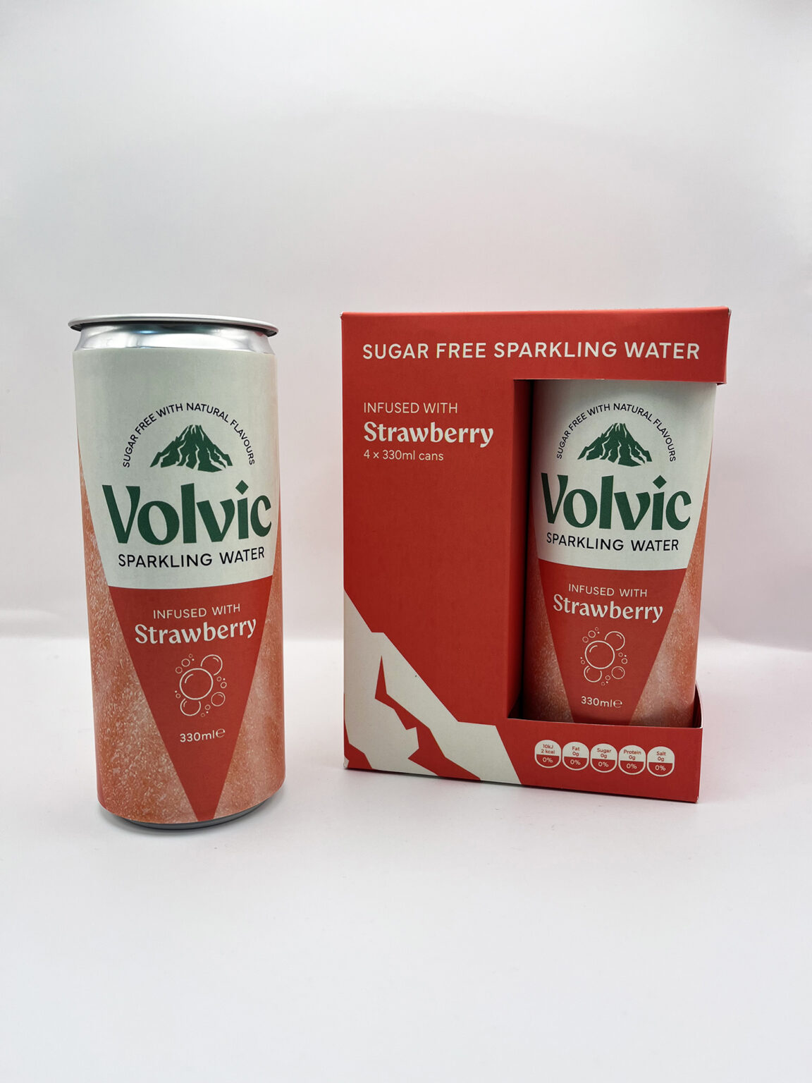
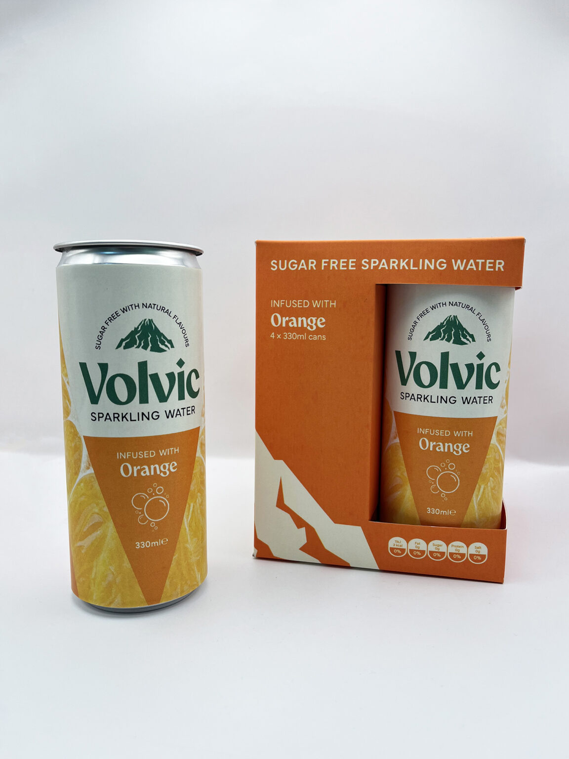
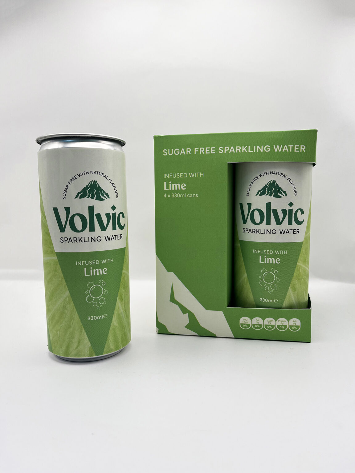
I chose to repackage the Volvic flavoured sparkling water series since its original visual identity focused on brand image, rather than the product benefits such as sugar free fizz and natural flavourings.

Each can is surrounded by an extreme close-up image of the fruit that contributes to its flavour, enhancing its natural appeal.

For each flavour, a multipack box has been crafted, with a purposeful cutout that allows customers to interact with the product before buying it – an approach not seen across the flavoured sparkling water market.

Alongside the actual products, physical and digital billboard campaigns were also created to target commuters.