Hi! I’m Mya, a graphic designer with a passion for music packaging, editorial design, and branding. I love creating thoughtful, visually striking work that communicates with purpose and meaning. My design process is deeply research-led, ensuring every project is driven by a clear concept and strong visual direction. Throughout my time studying graphic design, I’ve developed skills in typography, layout, visual storytelling, and critical thinking.
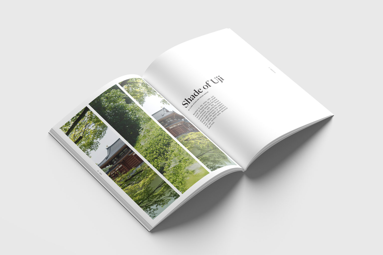
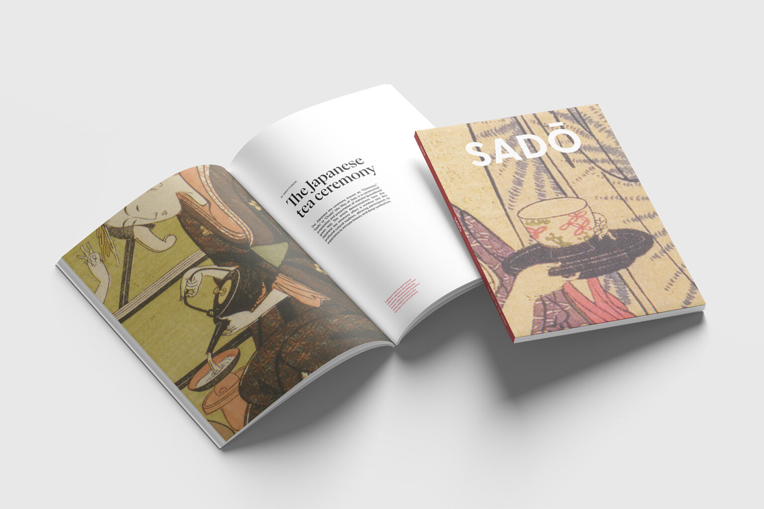
Sadō is an independent editorial magazine celebrating the beauty and ritual of tea culture. The first issue focuses on the Japanese tea ceremony and its national tea, green tea, combining generous white space, refined typography, and historical imagery to create a calm and meditative reading experience. The publication aims to capture the sense of serenity, mindfulness, and tradition embedded within tea culture.
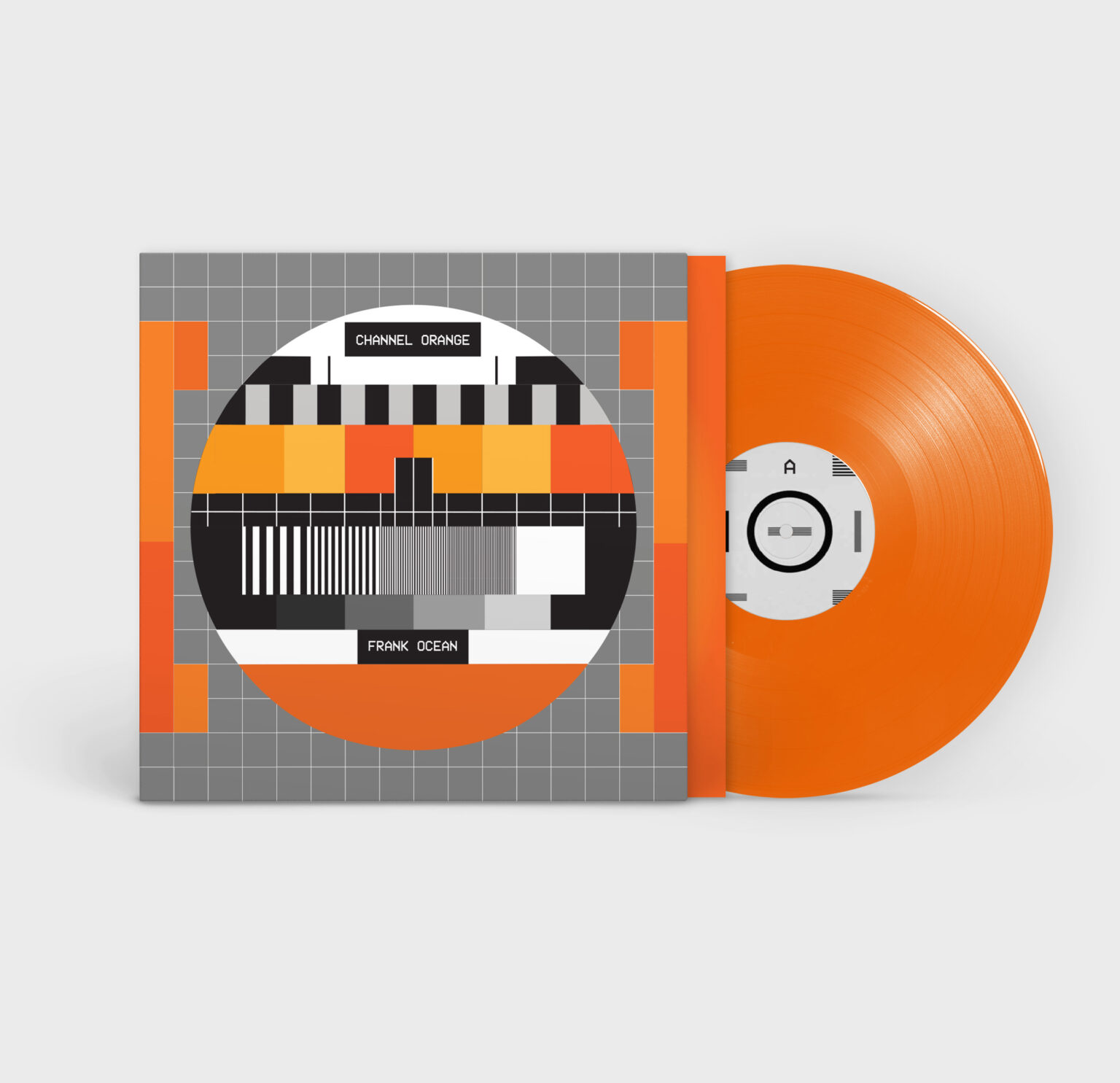
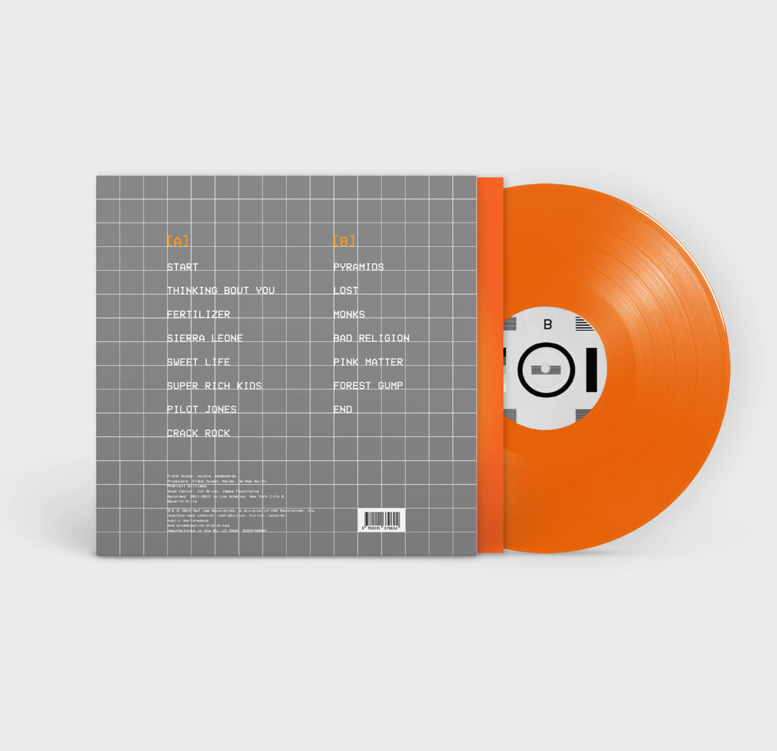
Channel Orange
Packaging
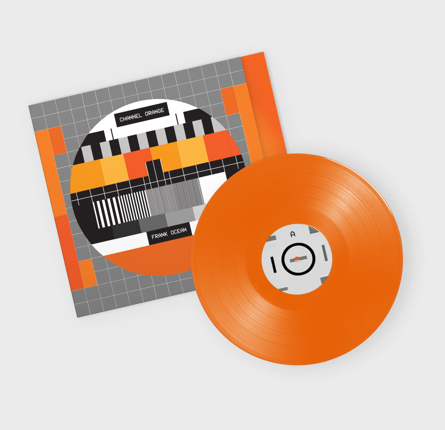
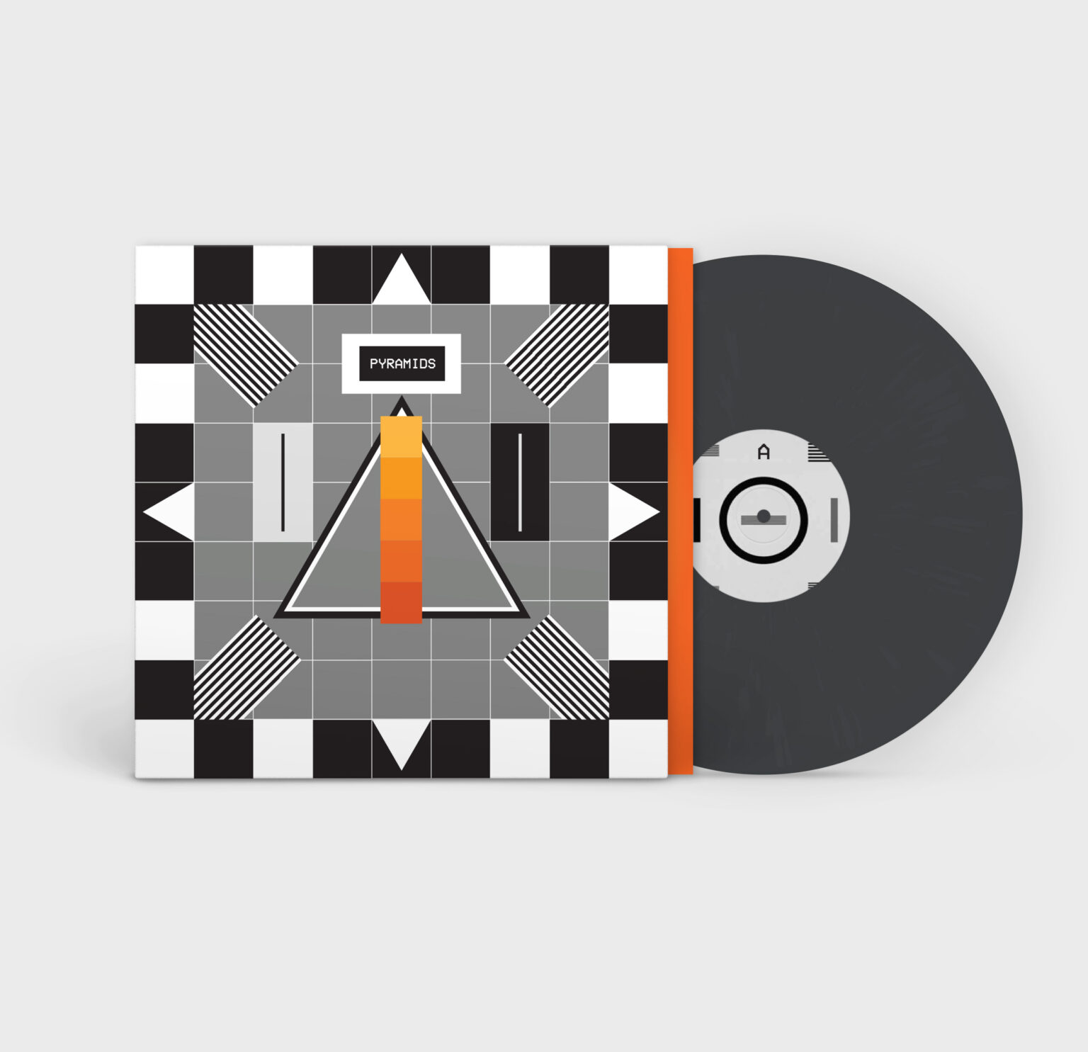
A reimagined visual identity for Frank Ocean’s album Channel Orange. This redesign explores the album’s recurring themes of television, nostalgia, and emotion through a bold orange colour palette and the integration of the iconic TV test card graphic. The project also includes a 7” vinyl design for the single Pyramids, extending the visual language across the full packaging experience.