Hello, I’m Oscar, a graphic designer and photographer with a detailed creative eye. I enjoy bringing photography and typography together within editorial contexts. I am also passionate about exploring the tactility of design through carefully considering paper stocks, bindings, printing techniques and integrating analogue mediums into my work, such as shooting photographs on film and printing wood type with letterpress. I take pride in my strong work ethic and my ability to think creatively, to find unique answers to briefs – having the drive to continuously work until the project’s full potential is reached.
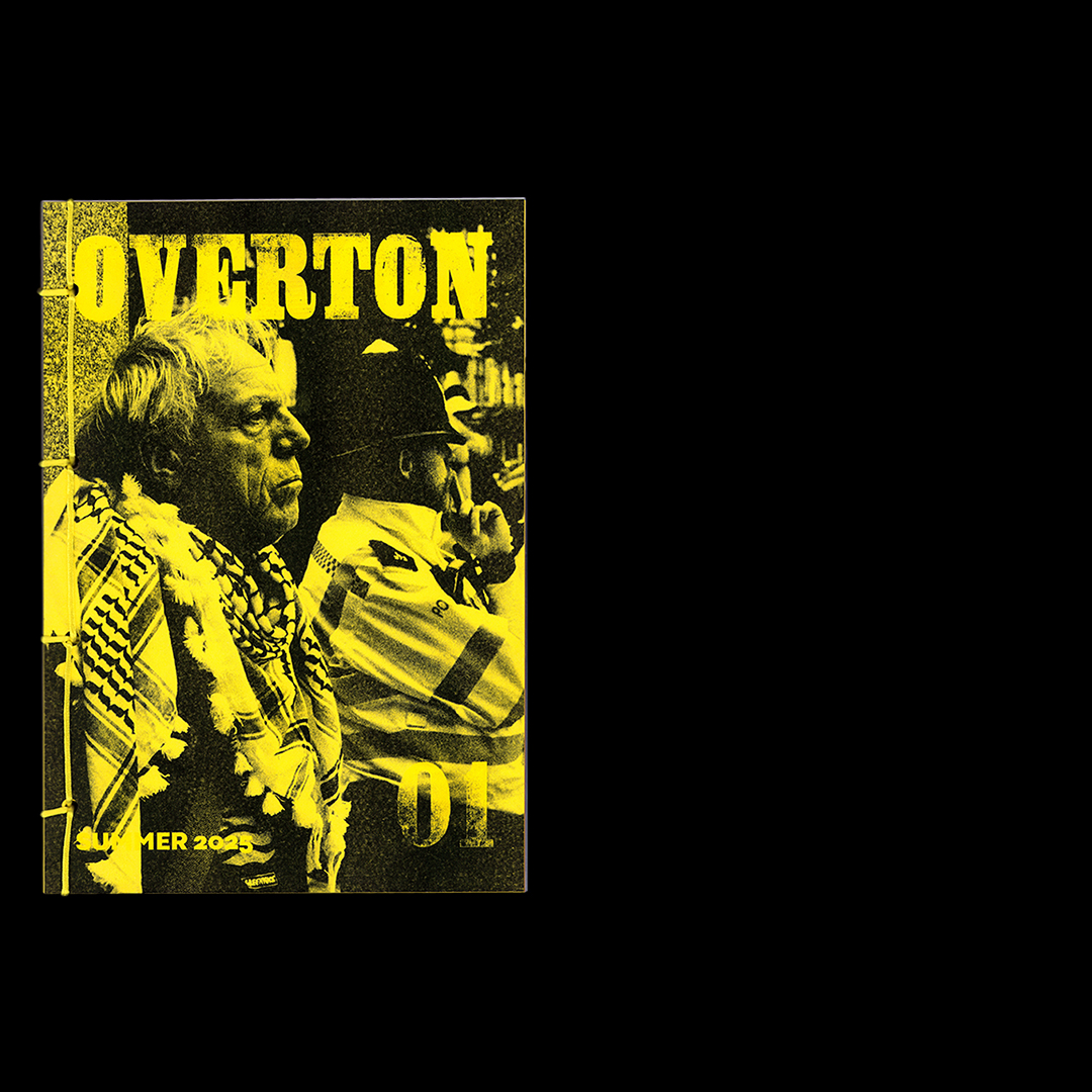
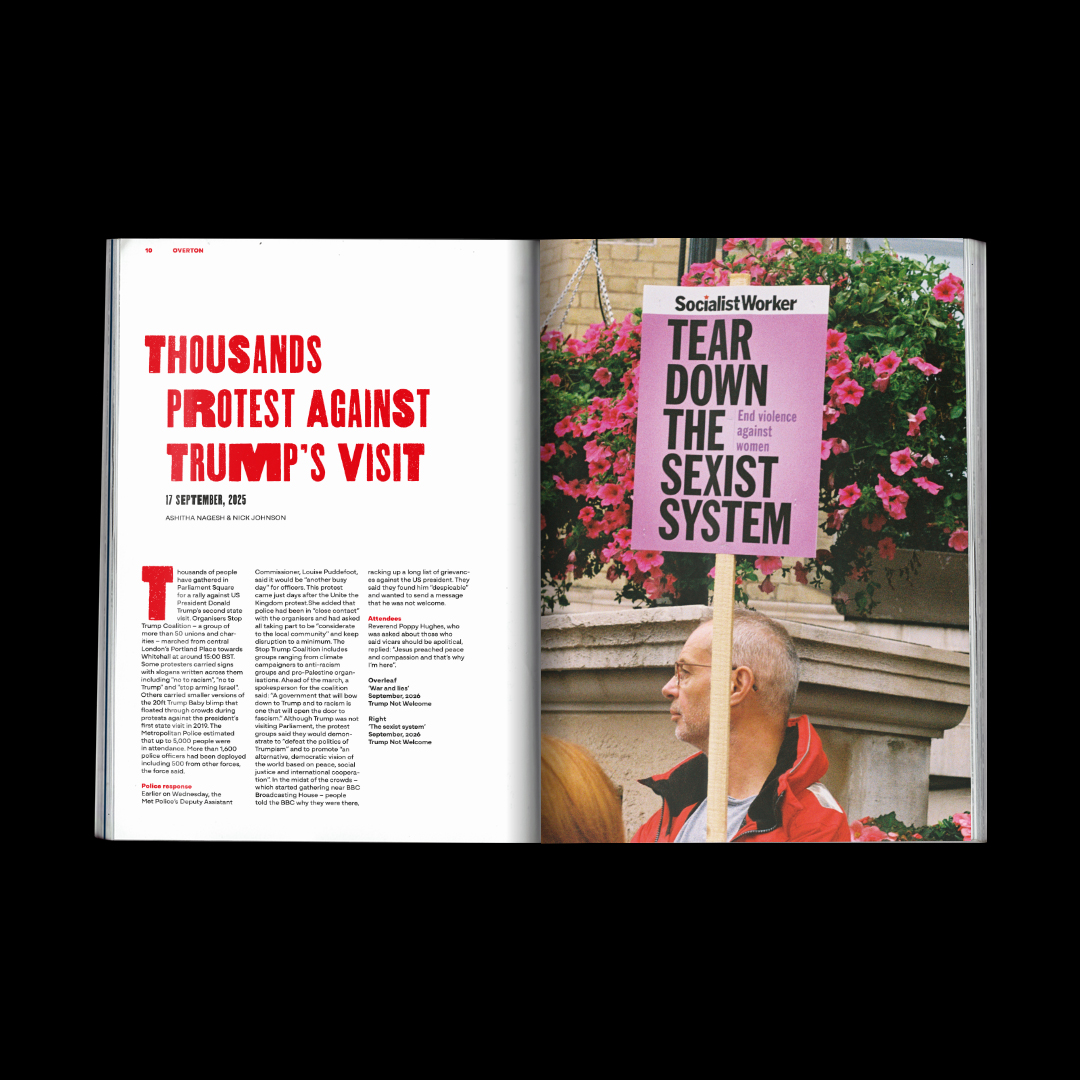
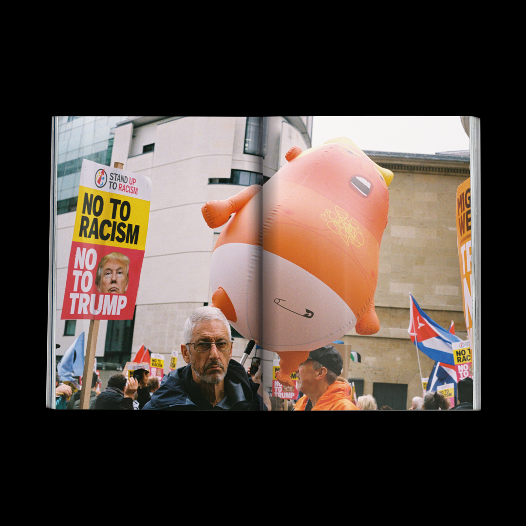
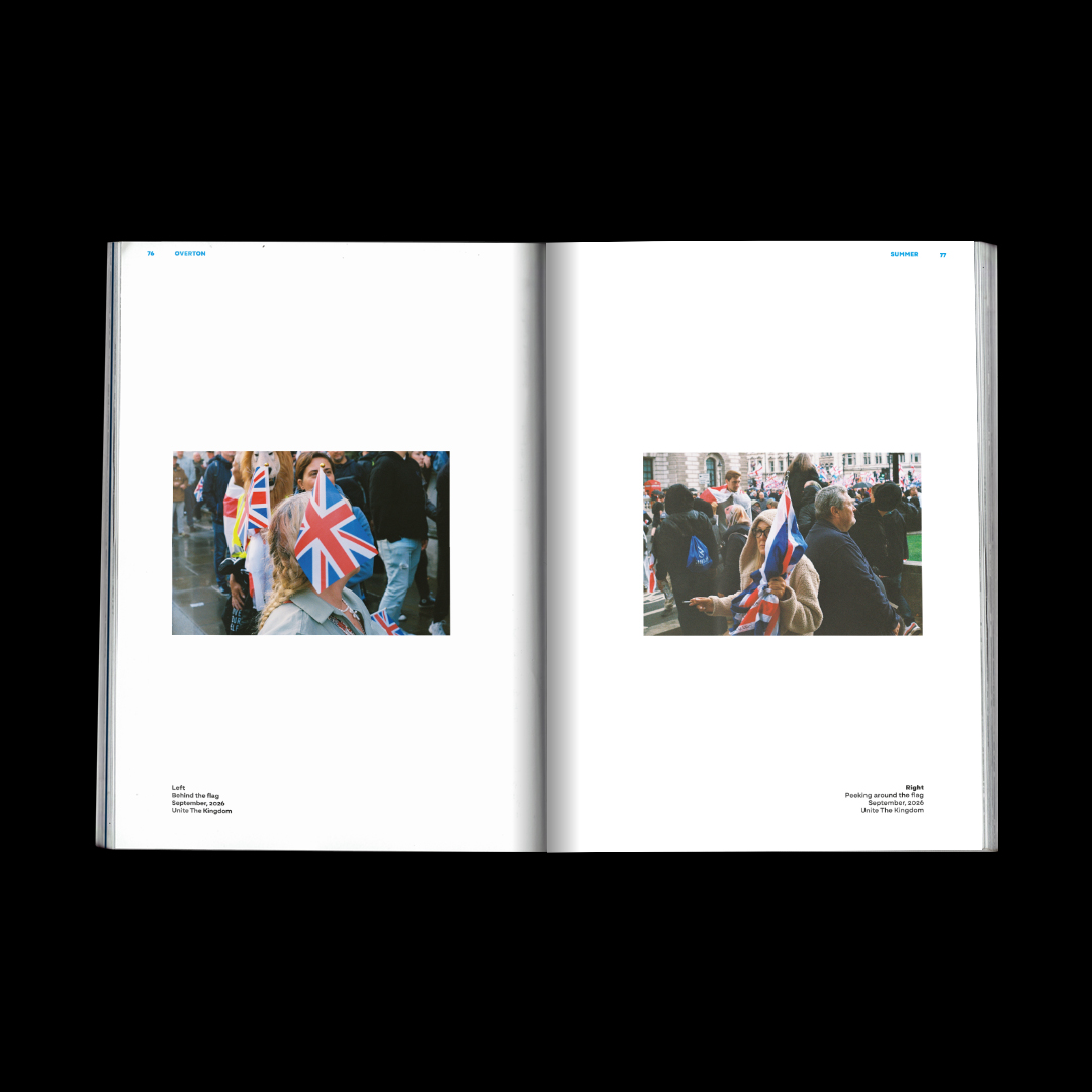
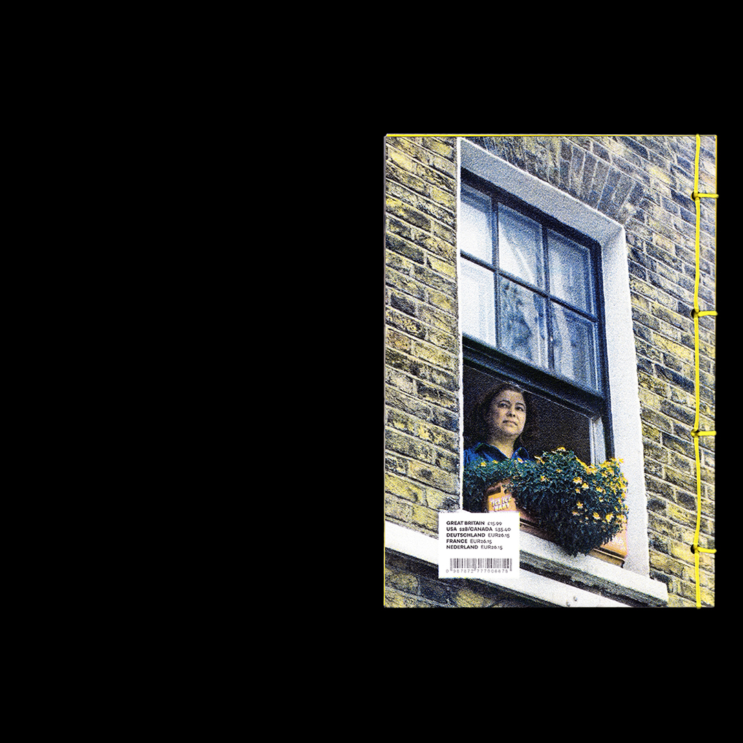
This is Overton, a quarterly magazine dedicated to documenting protests on both sides of the political spectrum that unfold on the streets of London. Issue 01 is dedicated to the protests of summer 2025 – capturing the first ‘Unite The Kingdom protest’, and the preceding ‘Trump Not Welcome’ protest – each article written by different journalists. All photography is shot by me, on film. I printed Overton’s masthead (title) using letterpress to reflect the gritty subject matter of the magazine. To accentuate this, I risographed the front and back cover of each issue. Further, I Japanese bound each issue to make the reader pick up the magazine and become more involved in the reading experience.
Depression Cherry
Packaging
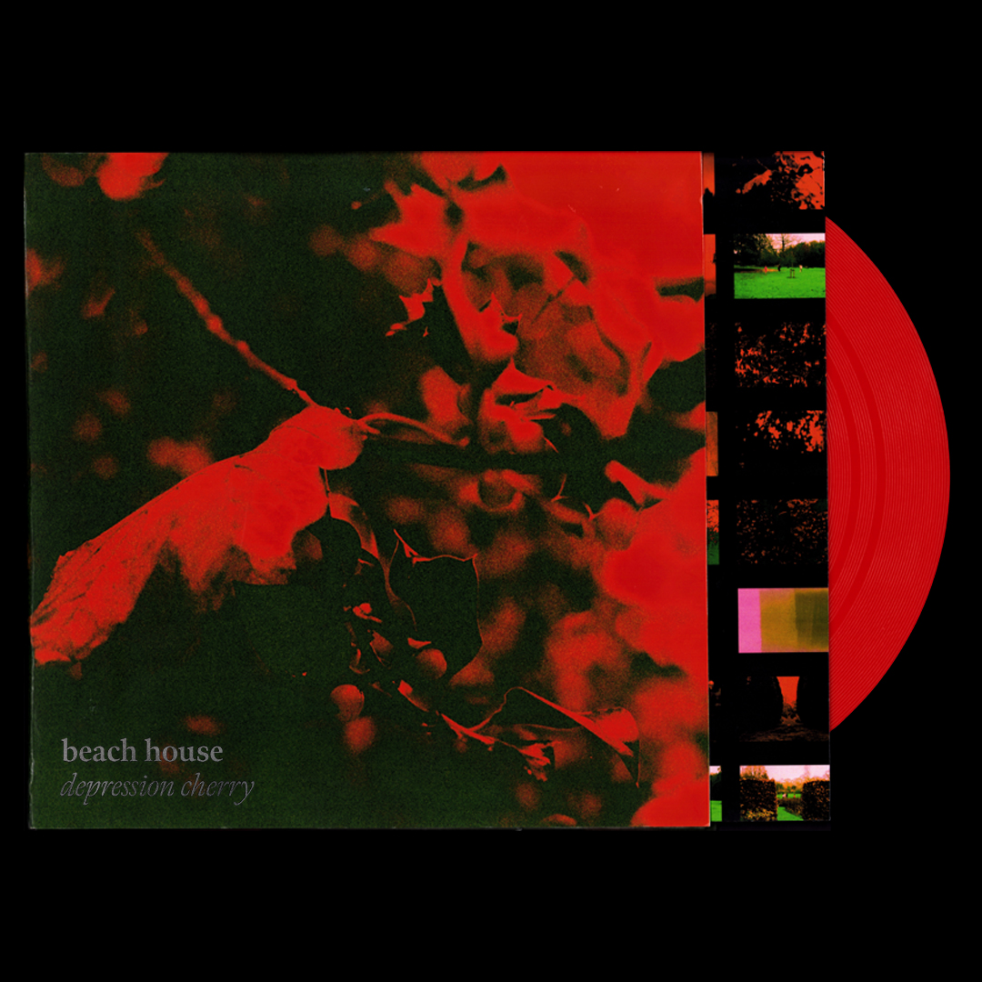
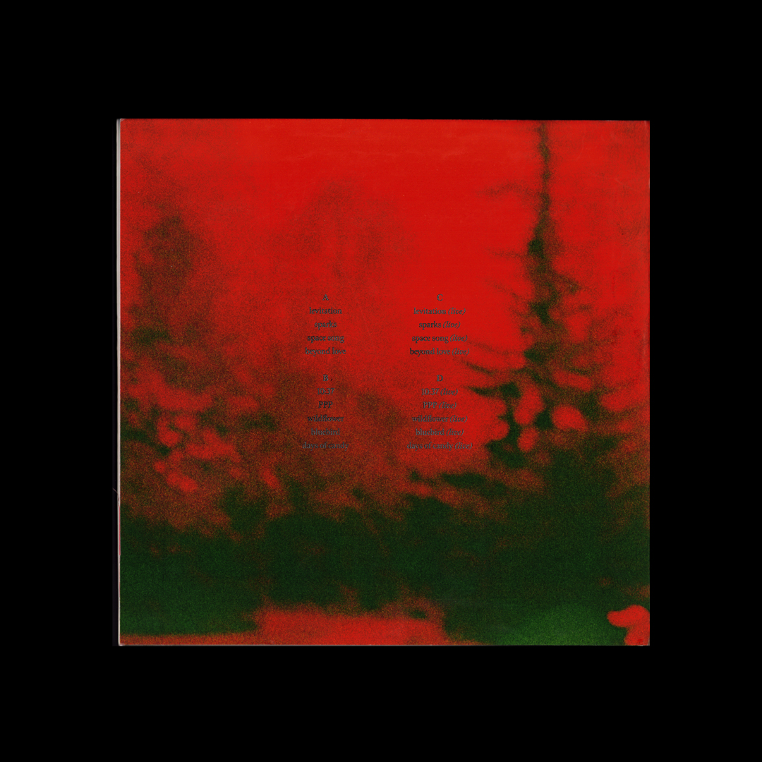
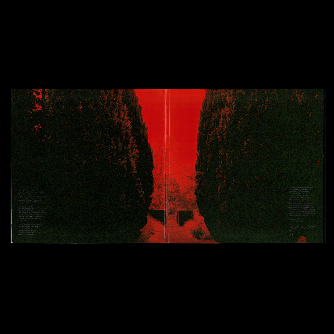
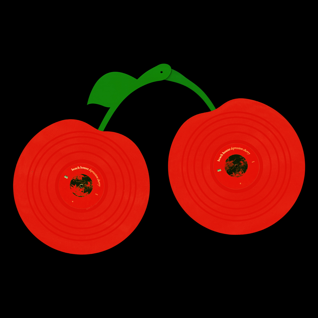
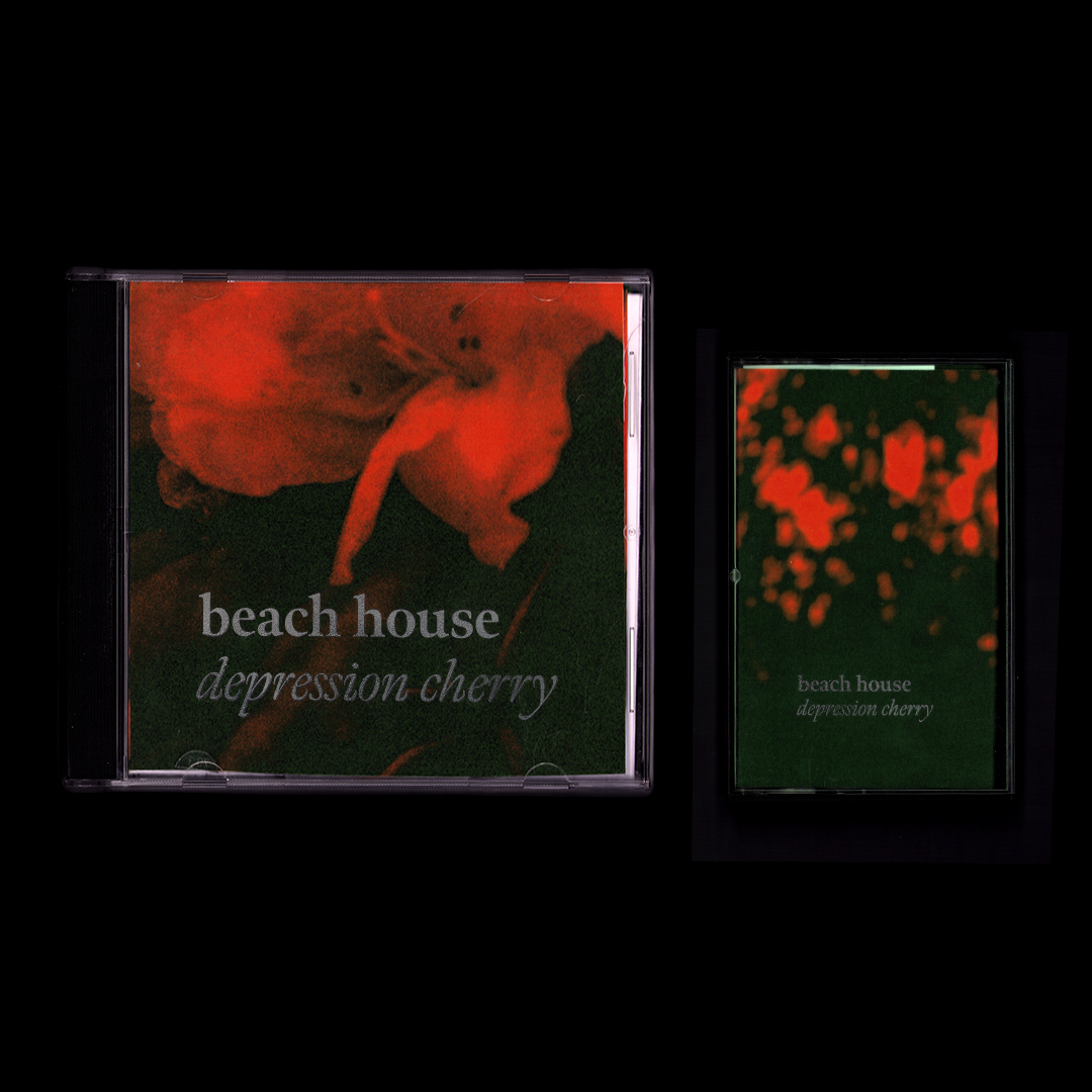
This is a redesign of dreampop duo Beach House’s 2015 album ‘Depression Cherry’. With this re-release, live performances of each track from the album were included, accommodated by three core outputs; a double gatefold record jacket, CD and cassette tape. I shot all photographs on expired motion picture film through a red filter to keep the essence of the original LP alive. The silver-foiled accents provide contrast, complimenting the grain of the photographs.